
Scroll Edit 2 - phoebephilo.com
After leaving her role as Creative Director of Celine in 2018, Phoebe Philo is back— with an editorial inspired e-commerce experience.

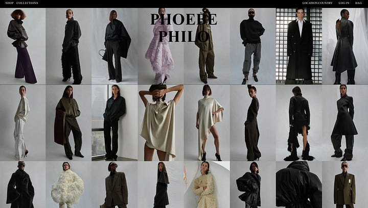
The design approach of the Phoebe Philo website reflects her own aesthetic: luxe minimalism. It is bold, crafted for its users—modern women who want to browse the collections, an important aspect given her digital-first approach with her namesake brand. The site features a sleek, modern design with unconventional yet practical tweaks to e-commerce.
While a digital-first approach gives businesses greater control over strategy and data collection, it also prioritizes direct digital communication with customers. Building a direct-to-consumer e-commerce brand requires more upfront investment than wholesaling but offers better profit margins and greater control over pricing and strategy. Going direct also helps brands stand out in a crowded market. However, success still depends on creating engaging content and building a strong social media presence.
Phoebe Philo’s products are available in select stores worldwide, such as Dover Street Market, Bergdorf Goodman, 10 Corso Como, The Webster etc. When she announced her return with her namesake brand in 2023, Philophiles and fashion enthusiasts eagerly awaited her debut collection. Personally, I was also curious to explore phoebephilo.com
The Impact
LVMH backed name sake brand emphasis being an impactful fashion brand and it reflects on the brand in various aspects. You may refer to their testimony below.

Let’s talk about the impact of phoebephilo.com’s user experience! Instead of a typical e-commerce experience, users are immersed in a digital luxe fashion experience.
Today, the web is cluttered with pop-ups that disrupt the user journey—one of the biggest usability issues, according to the Nielsen Norman Group. What immediately caught my attention while scrolling the website was how smooth and luxurious the experience felt, almost like browsing in a boutique. It is distraction-free, with no intrusive pop-ups interfering with the main content.
Isn’t a distraction-free life modern luxury?
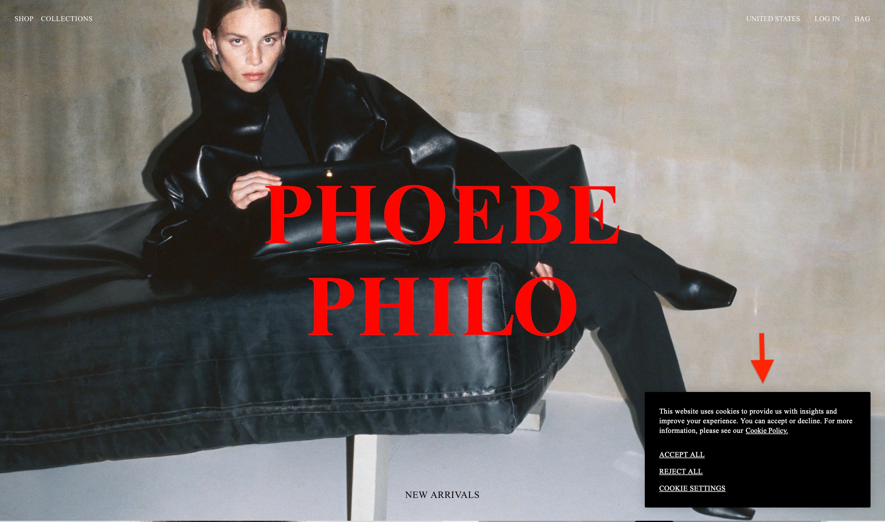
This screenshot captures the homepage, where the cookie policy is discreetly placed in the lower right corner, ensuring visibility without disrupting the user experience or key content.
Work.co studio states the core design decisions on their website as:
Creating an image-forward experience
Prioritizing a flexible framework, allowing for future spontaneity
Focusing on a straightforward shopping experience, designed for limited quantities
Luxe - Fashion Experience
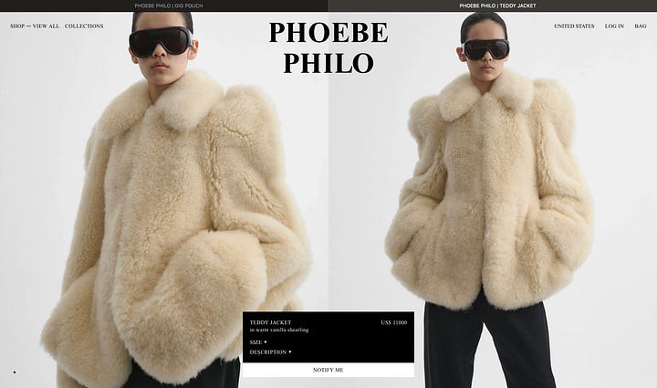
A seamless, uninterrupted fashion experience—free of pop-ups—where campaign imagery takes center stage, with only essential details like pricing and product names available.
The spacing between buttons and text is tighter and positioned along the edges of the page, allowing the products to take center stage. While these design choices deviate from most online shoppers’ mental models of an e-commerce website, they create a deliberate aesthetic balance, prioritizing a refined visual experience over conventional UI patterns.


Image Quality
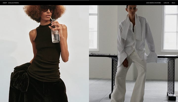
While the designers prioritized an image-forward experience, the campaign visuals are truly exceptional. Each product image is intentionally captured, reflecting the essence of the designs and recreating their real-life shapes and movement.
When it comes to image quality, many e-commerce platforms like FRWRD.com, Revolve.com, and TheRealReal.com fall short—scrolling through their pages often lacks appeal due to poor imagery. Yet, product photography is one of the most critical communication channels between a brand and its customers.
What Phoebe Philo’s team excels at is owning this communication channel and maximizing product storytelling through high-quality imagery and editorial-style catalog presentation.
The details showcased in product photography are crucial, especially for a brand with limited physical store presence. Understanding the needs of the modern woman and what she requires before making a purchase is key to delivering an effective digital shopping experience.
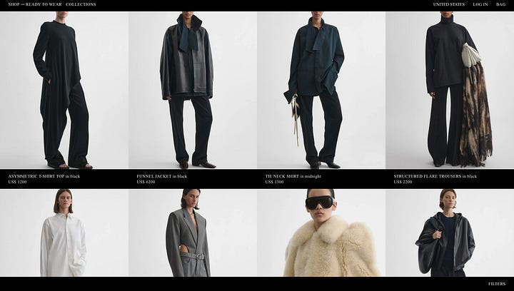
screenshots of several product pages Bag Images
The placement of bags—whether positioned on a pedestal, hanging from a hook, or allowing fringes to flow freely—is carefully considered. Even though the images follow a distinct artistic direction rather than a uniform layout, the photography is purposefully designed to enhance the product’s visual narrative.
As a bag enthusiast, I value functionality just as much as design. A purse is both a product and an object of craftsmanship—beautifully designed and meticulously crafted. The story telling of this balance between form and function is what makes these images so appealing to me.


The Challenge: Responsive Design
Even though the website maintains a highly symmetrical design on desktop, the mobile experience lacks the same sense of luxury. (Personally, I find designing for larger screens more inspiring, while the real challenge begins when adapting to mobile.)
However, with most web browsing now happening on smaller screens, mobile design can’t be an afterthought—it needs to be just as refined and intentional.
Accessibility issue for clicking to the menu, when the product image and menu buttons overlay, without any solid separation. Leading wrong clicks and frustration to the user.
Personal take, as an actual user of this website, I’d prefer using the website on my laptop and visit the Instagram account for on my phone for a more pleasant experience.
Big PHOEBE PHILO text is blocking the image, on a smaller screens it is unpleasant, disrupting the luxe desktop experience I have been talking about.
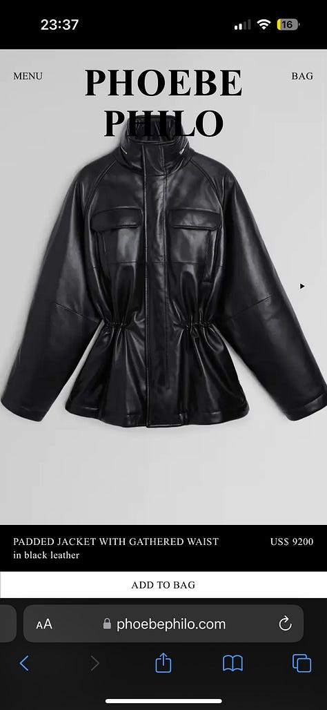
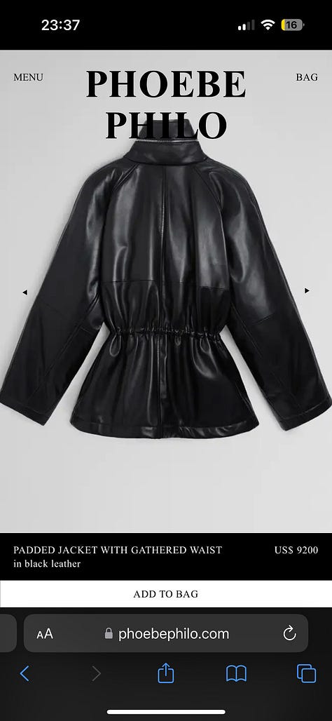

screenshots of a product page on a mobile device On the product pages, mobile has a longer bar for product details vs. on desktop the block. Which I prefer better to the information/” add to bag “ block.


Imperfection is a new design trend in many creative fields including web design. As UX designers, it’s essential to balance aesthetics with accessibility and usability, ensuring that this trend enhances—rather than hinders—the user experience.
Straight Forward Shopping Experience & Creating Living Information Spaces
What makes the minimalist approach to her brand identity so compelling is its intentional simplicity. The same carefully curated images appear across social media and the website, reinforcing a cohesive and unmistakable brand image. By delivering only essential content, the brand maintains a refined, consistent, and effortlessly recognizable presence.
One of the defining aspects of this approach is the seamless integration between social media and the website. The same campaign imagery is used across platforms, reinforcing a consistent brand identity and creating a fluid, omnichannel experience. This ensures that users encounter a cohesive narrative, whether they engage with the brand through Instagram or directly on the website.
Unlike traditional e-commerce sites that prioritize volume, Phoebe Philo’s website embraces intentional scarcity—both in content and in product availability. This approach not only elevates the luxury perception of the brand but also transforms the digital space into something more than just a store; it becomes a carefully orchestrated brand experience.
Site’s editorial influence sometimes over powers the e-commerce store experience, offering users the timeless yet innovative designs -both products and digital experience.
Competitor Analysis
I asked myself “How does the minimalist approach affect the usability?’, “ Is it easy to navigate despite limited information? “
In order to answer my questions, I decided to take a field trip on the fellow minimalist brands like The Row, TOTEME, Khaite and conducted a competitor analysis, stay tuned !